
- This is a summary of my experiences with trying to get the best and sameish color experience on 3 vastly different monitors
- Color management on Windows is a bit of a mess
- Microsoft seems to be actively working on improving the situation with ACM
- Microsofts active work with ACM is still a bit of a mess
- Color management in general is actually quite a mess
- This is because color is a complex topic
- New monitors generally cover more than sRGB, and that might be a problem for sticklers
- There is a few solutions to get all monitors to look the same, always, but none is 100% perfect (yet)
The full story
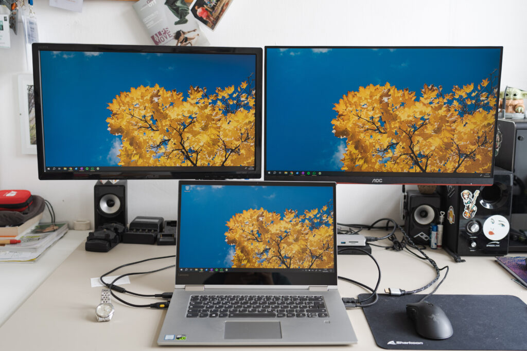
I’ve recently acquired a second external monitor for both my day job and my photography requirements. For photography, most of my work revolves around digital publishing, so I don’t necessarily care much for wide-gamut monitors (Adobe RGB, P3 and whatnot); instead I aim to get all of my monitors to conform as closely as possible to sRGB with a whitepoint of 6500K. To achieve this, I always checked if the device I was about to buy would cover sRGB properly and then pulled the trigger. Until recently, almost all of the devices I had acquired needed some additional calibration, but after the calibration they all looked more or less the same, in every application.
Enter my most recent acquistion, the AOC 24G2SP; a quite affordable 24″ 1080p IPS monitor which fully covers sRGB (and then some) with a maximum refresh rate of 165Hz. The refresh rate was in fact the main reason for the acquisition, as it just offers such a big improvement to the look and feel of everyday tasks on the desktop that going forward I will no longer be able to buy anything but high refresh rate screens. The monitor also supports G-Sync and FreeSync, which allows the panel to dynamically adjust refresh rate to match it to the fps output by the graphics card; quite useful for the occasional bouts of gaming (recently that’s mostly Helldivers 2).
Anyways, one thing I immediatly noticed when plugging the monitor in, was just how saturated everything looked (honestly, in the foto it is actually hard to tell 😅):
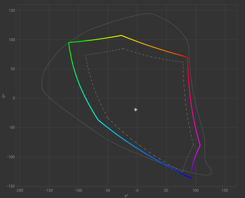
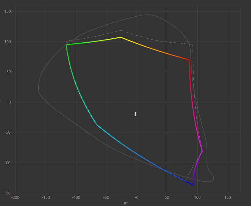
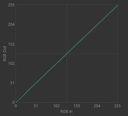
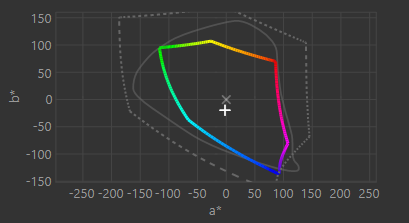
Easy fix, I thought, just run the monitor through my usual calibration gauntlet using DisplayCAL in conjuction with my Spyder 5. This calibration process takes around 40min. to one hour, but after that you receive a profile that should calibrate your monitors to all look the same, or so I thought… Instead, what happened is that I got a clear confirmation, that the monitor does indeed cover the sRGB spectrum (dashed line) and even a bit more; in fact it covers a good bit of the P3 gamut:
Now, this would all be fine and dandy, but my original problem persisted: All colors looked extremely oversaturated on the desktop, even after installing and activating the profile… Indeed, there was no noticable change in terms of saturation, compared to before calibrationg. What was going on?
What is and what isn’t color managed…
So, let’s preface this: At the time of calibration, all my PCs were running Windows 10 22H2 (Build 19045.4355) and I’ve been using DisplayCAL Profile Loader to load my display profiles (installed as .icc profies). Either way, for a minute I was worried, that all my color grading up until this point was for naught and that all my photos and videos would have been skewed to the properties of a certain monitor, but luckily, that was not the case: It turns out that in general, nothing in Windows is actually (fully) color managed. This means that desktop, games and other non-color-managed apps will all remain (mostly) unmanaged, even if you assigned a profile to the display. This may seem confusing, since when you load a profile you can clearly see the colors on the desktop change, but it appears that this is not full color-management but rather just a part of the profile is loaded: The vcgt or “video card gamma table” and the calibration curves.
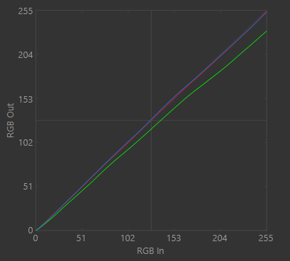
Applying the vcgt and calibration curves already goes a long way in getting the monitors to look to same. These curves will be used to fix the monitor’s gray balance, adjust the white point, and tweak the tone response so it’s closer to the ideal output. What this ultimately means is that extreme color shifts will be corrected and that black/gray-levels will also be adjusted (e.g. if a monitor only supports Full RGB (0-255) values, but your GPU only supports outputting Limited RGB (16-235) to it for some obscure reason; thanks Intel ;)). What this does not do, however, is the “Colorspace conversion” or CSC. This is a problem, because non-managed applications (i.e. the Windows desktop) assume that the connected monitor only covers the sRGB color space. In fact, non-color-managed applications generally assume to run in an sRGB colorspace and expect that they output to an sRGB monitor. However, as I allured to in the first part of the article, that is not the case for my newly acquired AOC 24GSP2 display (see the gamut coverage graphs).
Colorspace conversion by managed apps
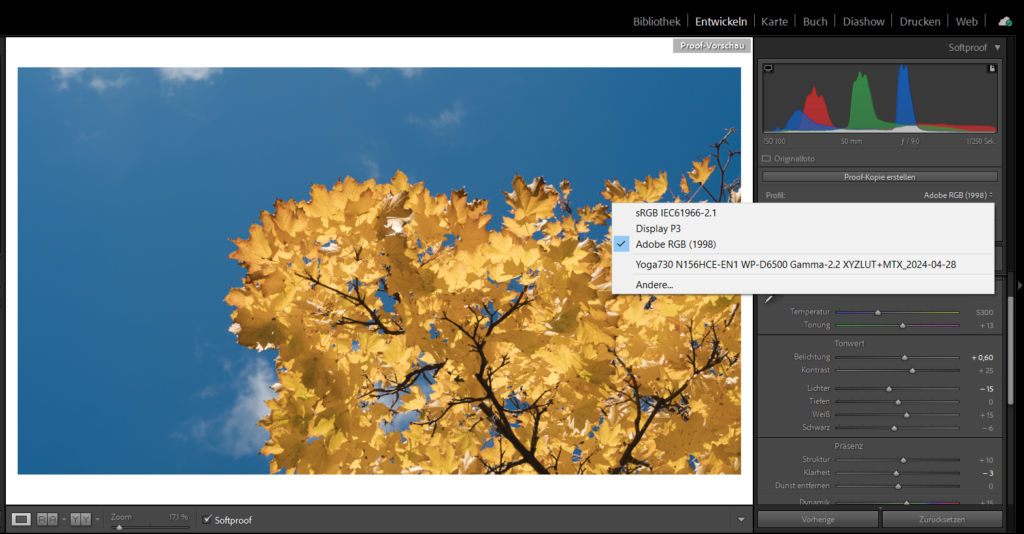
So what exactly would color space conversion do? To put it simply, it converts a colorspace, say sRGB, to another colorspace. The ICC display profile essentialy allows color managed apps to map their colors to the one of the monitor. So when you have a pure sRGB red on-screen (255,0,0)1 this would be mapped to something like (235,10,10) instead on the “wider-gamut” display. Booting up Lightroom quickly reveals that “color managed applications” or “color-aware applications” use all of the profile, not just the calibration curves. This means that colors are properly mapped from whatever workspace color is defined in the application and then these colors are mapped back to the corresponding values for each monitor by using the LUT (Lookup table) or curves in the profile. This is actually visible when moving the Lightroom window from one screen to another, as the image quite cleary changes colors a short moment after being placed on the other screen. So in essence, if you want to see the images as closely as possible to how they would look like, you should view them in a color-managed application. Note, however, that Lightroom Classic uses Adobe RGB colorspace for the Library, Slideshow and ProphotoRGB color space for its develop module2, which means that the colors you see in Lightroom might be considerably more nuanced than what you would would be able to see on an sRGB screen. So if you are using a “wide-gamut” or “wider-gamut” screen, you might be seeing more colors, than what you would be exporting to an sRGB JPEG. To actually see the image in the colorspace you want to output to, you would need to use the “Softproof” feature in Lightroom Classic, which lets you select various colorspaces.
So, all is good, right? Well, only partially. At least it seems I can rest assured, that as long as I use color-aware apps, the colors will be displayed accurately and to the best of my monitor’s capabilities. But the original issue remains: Anything outside of color-managed apps will look oversaturated on wide-gamut dispays. So how to fix this?
The solution(s) to the “problem”?
In essence, I’ve found a couple of approaches to get the images to display correctly on the windows desktop and non-managed apps, but most of them come with caveats, some bigger than others. I wont present all of the solutions in detail, but only present them shortly and then look a bit closer at the ones that I find worthwhile, so here goes:
- Save the image in the colorspace of your display
- This is a quite crude approach in my opinion. Yes, it will make the image display correctly on that single monitor for non-color-managed apps, but it will look completely off on every other monitor and in fact even in color-managed apps.
- Use sRGB emulation on your display
- This tends to actually work quite well and with little effort. Essentially, some displays (as does the AOC 24G2SP) offer an “sRGB mode”, which clamps the colors to the sRGB color space. Unfortunately, many monitors lock down all settings (like brightness) in that mode, which in the case of the AOC is a quite bright ~180cd/m². Also, the calibration of the sRGB mode might be slightly off compared to the fine-tuned “User mode” settings, so colors might be a bit off with the profile created in “User mode”. Also, you basicly lose the wide-gamut capabilities of the display in applications like Lightroom, which could make use of it.
- Use sRGB emulation via the GPU
- This works for AMD directly from within the driver with and Nvidia you can use novideo_srgb. Since this software or driver-based sRGB-Emulation clamps the colors down to sRGB you will of course also lose any wide-gamut capabilities your display might have; similar to the hardware/display-based sRGB mode. I haven’t tried this yet, because my Laptop runs an older intel GPU (Intel UHD620), so I am not sure how existing display profiles behave in combination with this sRGB-Emulation
- Use a system-wide LUT with dwm-lut
- dwm-lut is a pretty nifty tool, that applies a 3D-LUT to everything (except for exclusive full screen apps). For this you need to first create a 3D LUT based on the calibration profiles for your displays. Then you can run this app and load that LUT. You can choose to include the calibration vcgt into the LUT or just do the gamut and color space mapping via the LUT.
- If you do include vcgt, you will need to select “sRGB IEC61966-2.1” as your monitor profile, or the color management will applied twice in color managed apps. Unfortunately, I have found that the calibration curves or vcgt is not quite as accurate with the 3D LUT (or maybe I did something wrong) and therefore the mouse and other high-contrast items would exhibit a strange green hue.
- If you don’t include the vcgt, you will need to apply the display profile for regular use, but you can’t use the dwm-lut in color-managed apps anymore, as the color space conversion will be applied twice.
- Also this method locks you to the chosen color space (REC.709, as sRGB is not an option at least when creating 3D LUTs with DisplayCAL).
- dwm-lut is a pretty nifty tool, that applies a 3D-LUT to everything (except for exclusive full screen apps). For this you need to first create a 3D LUT based on the calibration profiles for your displays. Then you can run this app and load that LUT. You can choose to include the calibration vcgt into the LUT or just do the gamut and color space mapping via the LUT.
- Create a CSC profile
- This seems like a very straight forward and good solution, but there must be some draw-backs. I might update this part once I have a better understanding of how these profiles work, but this is my observations:
- You can create CSC profiles using MHC2Gen (based on a DisplayCAL-Profile, fast) or using DisplayCAL itself (slow)
- It the Windows Calibration Loader to be active and in use (which is deactivated automatically when you have an active installation of DisplayCAL).
- Just eyeballing it, it seems less precise than other methodes in terms of calibration.
- Also this Profile limits your monitor to the sRGB Gamut/Colorspace so you would need to switch profiles when you want to use the full capabilities of the monitor in color managed apps
- This seems like a very straight forward and good solution, but there must be some draw-backs. I might update this part once I have a better understanding of how these profiles work, but this is my observations:
- Use Windows 11’s ACM feature
- This seems to be the only real solution with no drawbacks and uncertainties. The idea here is that the OS fully takes care of color management. This has some notable advantages:
- All applications will look exactly the same, including the Desktop.
- Color-managed applications can still make use of the underlying profile to access the wide-gamut of the display (if the apps are updated to suppert the new Microsoft API, or if you set the app to use “legacy color management”)
- The whole color pipeline is done in 16-bits per color instead of 8-bit, so conversion between colorspaces does not result in banding
- Windows provides dithering for 8-bit displays, so even with stronger color space conversions, banding should be reduced
- This al sounds great, but unfortunately the function is locked down to special “MS-approved” displays (mostly Surface line displays) and is seriously ham-strung by some bugs I’ve encountered in the color profile load of Windows 11
- You need to fullfill certain hardware requirements (my laptop does not, but my desktop PC does):
- AMD: RX 400 Series or later/ Ryzen processors with Radeon Graphics
- Intel: 12th Gen (Alder Lake) or later integrated GPU; Intel DG1 or later discrete GPU
- NVIDIA: NVIDIA GTX 10xx or later (Pascal+)
- To enable ACM on common monitors, I had to add the DWORD key
MicrosoftApprovedAcmSupportwith value1in the registry atHKEY_LOCAL_MACHINE\SYSTEM\ControlSet001\Control\Class\{4d36e96e-e325-11ce-bfc1-08002be10318}\000xwith000xbeing the index of the currently active/desired display.3 - Unfortunately, when more than one display is connected, the profiles of display 2 are assigned to display 1 for some reason and therefore I end up with completely wrong colors
- The color profile loader seems to be somewhat unreliable in general on Windows 11 23H2 (at least in my experience)
- You need to fullfill certain hardware requirements (my laptop does not, but my desktop PC does):
- This seems to be the only real solution with no drawbacks and uncertainties. The idea here is that the OS fully takes care of color management. This has some notable advantages:
- Just live with it and don’t be such a stickler (but do calibrate your monitors for color-managed apps, even if you are no stickler!)
That’s a quick summary on what I think I learned on this journey. If there is any interest in a more detailed writeup on any of the mentioned approaches, I guess you could let me know in the comments below.
Sources and footnotes
- https://www.dpreview.com/articles/6848926575/intro-to-color-calibration-how-monitor-calibration-actually-works
- https://www.displayninja.com/what-is-srgb-emulation-mode/
- assuming 8-bit per channel, i.e. 24-bit color (or 32-bit including the alpha channel) ↩︎
- https://helpx.adobe.com/lightroom-classic/help/color-management.html ↩︎
- https://github.com/dantmnf/MHC2/issues/10 ↩︎